I need to let you all know that while we do have some water damage downstairs, it seems to amount to a line along the join of the ceiling boards in the living room. It is not horrific,but it is definitely there! We are lucky it is a warm day, and that things are drying quickly. I do think we are going to have to do some followup and remodel in our bathroom...the floor is coming up now...but all told, it could have been a lot worse!
Meanwhile, I haven't put the time to waste today...I've been working on the Entry floor again...
First, another photo of where I am headed...I took it a bit farther last night after I posted... yeah, I know I said I was quitting....I lied.
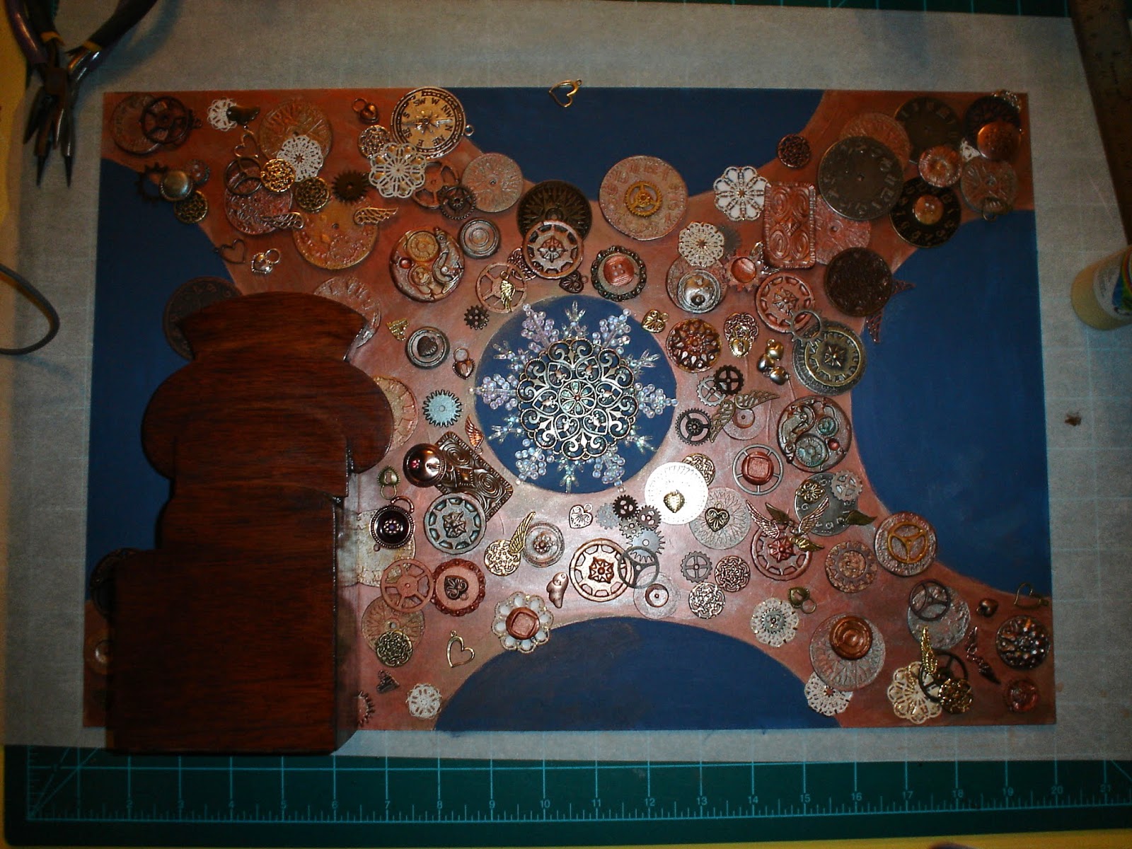
I wonder if you all can even see the changes...mostly what I was doing last night was practicing...trying to take things up a notch to create the Steampunk feel. Things are closer and less regular, and there are smaller bits that are not the disks I have been working with...Overall, I think I like where it is going.
BUT, the more I looked at that floor, the more I realized I just didn't quite like it. It was OK, but it didn't look natural enough for me...so I went back to the drawing board. This time I did a little better job keeping a record of how I got there...though I still think I fail there! I just get too into what I am doing, and forget.
Here is the process used on the second go around:

First, I re-cut the board, this time remembering to make allowance for the doors. I totally forgot on the first set. I still forgot on the entry door, but I think I can work with that one fairly easily, so I didn't reject this try.
I painted the new illustration board "Orange Orange" by Delta Ceramicoat, a very bright, almost translucent color. I followed that by stippling with Americana's Mississippi Mud, using a sea sponge.
Next I used the same sea sponge to add Delta Ceramicoat's Red Iron Oxide, which gave me a textured, mottled stage, which you can see on the right end of this photo.

The next coat that you see in progress above is another Orange called "Mandarina" by Folk Art. As I moved throughout all the coats except the very first one, I used a twisting motion with the sea sponge, which softened the textures.
I added subsequent coats, using the same process, of "Venetian Gold" Metallics paint from Deco Art, "Warm Penny" from the same series, (a soft warm copper color) and "Ruby Royal", another metallic copper color from the same series of paints.
Finally, I went back in with "Burnt Sienna" by Americana. This gave me the basic look I wanted, which you can again see in the right side of this picture. In progress below is another coat of the "Mandarina". .

I finished off the main set of layers with a layer of the "Warm Penny" Copper. Then I dabbed in both "Venetian Gold" and "Red Iron Oxide" again, very lightly, and wiped it out with a paper towel.
The half circles each then got painted with a Latex Paint - in a Charcoal Grey.
The final result appears as you see below.

I am much happier with this color combination than I was with the earlier version. It does have a similar feel, but the textures look much more natural to me.
Placed in the Entry, here is what it all looks like together.

It makes me happy. I think it is exactly what I wanted to convey with the floor. The gold and copper colors are so shiny in this that my photos are turning out with a lot of glare...the picture above is the only one I got that really came out at all...I am going to have to get a better camera (and training to go with it!).
Now that I have all the coloring right for the illustration board, I will begin to actually attach the resin and metal parts to the floor, and add the resin to the whole floor. My hope is that the entire floor will have a smooth, glass like finish. We shall see...this is all new..so no framework to judge whether or not it will work as planned.
I am still trying to decide whether I want to add the center circle of paint in under the center medallion I planned. I'll think on it for a bit...and surprise you all later!
Until then!
Doug S
Hello Goug,
ReplyDeleteI love the new color combination. When I think steampunk I think of copper and brass...this floor very much conveys the copper feel to me and I think the textured effect is very successful.
Glad the damage is not TOO bad, but still I hope fixing it will be fast and painless.
Big hug,
Giac
Hi Giac! Thanks for your comments! I really do appreciate them... I am excited that you are following...its a little like having my "teacher" buying stuff I make. It is a real compliment to me that you are liking what you see.
DeleteOn the water damage front, we've decided we better call our insurance company...Things are still not dry...and I think we'll have to do a bit of work. We'll get started on figuring that out for sure...But, this is called "life". Things fall apart!