More Pages

Thursday, October 1, 2015

EPIC FAIL
(or Doug's Adventures in Miniature Stained Glass)


Disclaimer:  No Manor Doors were harmed during the disaster that follows


Train Wreck at Montparnasse in 1985

The Montparnasse derailment occurred at 4 pm on 22 October 1895 when the Granville–Paris Express overran the buffer stop at its Gare Montparnasse terminus.  The train was late and trying to make up for lost time, and entered the station too fast.  The driver crashed through the station wall and fell onto the street below - Place de Rennes, due to his air brake failing.  Unfortunately, a woman who was temporarily standing in for her husband as a newspaper seller was killed.  The driver was fined 50 francs. 

I am reasonably sure that the minor disaster our Steampunk Manor door experienced was not near as severe as the Montparnasse derailment.  No one was killed.  Rather, the manor door was rescued, and is awaiting a new and better experience next time.  We hope.  Desperately!

However, it was a truly traumatic experience, and what is worse?  It isn't over yet!  


The Starting Point

But I WILL get ahead of myself, won't I?  Slow down Doug, and tell the story...one word at a time.

It began innocently.  As the creator of the Steampunk Manor, I have a very specific idea of what the Manor Door should look like.  It must be grand, interesting, and must mesh well with the already designed Front Windows.  A very simple request. Or so you would think. 

I tried...really I did.  I tried Glass Paint, I tried India Ink.  I tried them all over again.  I even thought about trying to find "the picture" of a stained glass window, and just print the crazy thing in 2D. Did it work?  

Well, you be the judge.


I DID manage to create the door of my dreams.  It was easy, if a bit time consuming. I cut out the wood shapes...varying each to provide interest on the two sides of the door (you get it, the INside and the OUTside, right?)  I dutifully sanded all sides, cut out a center third piece to act as the frame for the acetate window, and cut the acetate to fit.  All was well with the world.

THEN:


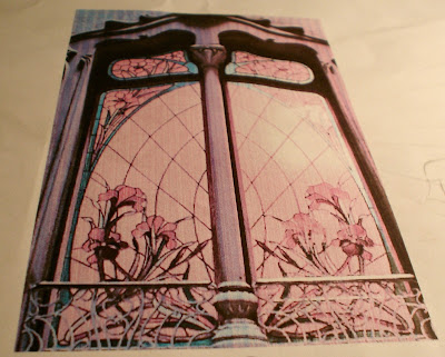
We began an attempt to create a beautiful stained glass door.  I had an inspiration picture.  I loved it. I still do!


Forgive the Yellow Cast...My Dining Table is Yellow!


I even managed to capture the essence of the design that I wanted for the window, get it proportional, and add the Art Noveau detail of the side windows to the design. I was on my way to success. Right?

Oh! So Wrong.

Wrong, Wrong, Wrong, Wrong, Wrong!


I started the little adventure using Liquitex Colored Ink.  Beautiful Colors, JUST the colors I wanted to use. 


I carefully painted each pane of the window design, using the utmost care to get even and beautifully blended colors.  This is what it looked like once it dried.


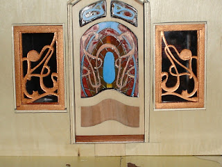
UGH!!!  Shiver, Shiver....Eeeew!    It looked HORRIBLE.  Victor Horta IS now turning in his grave! Right?!!

OK...grow up Doug.  The door is PERFECT.  Exactly what I wanted.


The Window?  Not so Much! 


It "SORT OF" achieves the effect I wanted in the dark....


And it is "SORT OF" OK from a distance.   But not really.  

So back to the drawing board.


So we tried Glass Paint.  This didn't even rate a serious effort.  It actually dries slightly better than this...but it is NOT the look I wanted for the Manor. 


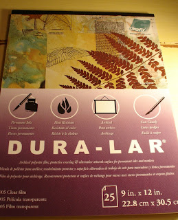
I did find out that it looks somewhat better when added to a different kind of acetate. This is a specialty acetate that is designed to accept ink and paints. 


The Glass Paint worked SLIGHTLY better on this.  It would be the RIGHT look for a small forest cottage or a bathtub sliding door.  Something to file away for the future, but definitely NOT suited for the front door of the manor!


I also tried the India Ink again, and Yes, it was much better on this acetate, but it still does not achieve the clarity I wanted for the front of the manor.

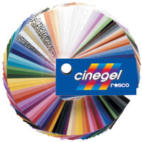
So far, we have failed.  But not to worry...we have another idea up our sleeve!   My next try will be to use a product actually designed for Photography...a diffuser and color correction product made of polyurethane plastic and a layer of deeply dyed polyester.   The colors are beautiful...and there are a myriad of colors.


More than enough to get the variety I had hoped to get with the window, and an opportunity to get a MUCH better color range than I have had with the other mediums.  The product is slightly expensive, but I did a test before buying.  I wanted to see if clear glue would be obvious behind this product. So far, so good. 


Sort of!

Hope you enjoyed my learning curve!  Under any circumstance, I must say that my fail was not QUITE as large as the Montparnesse accident...but it was close.  :0) 

I am hoping to show you a finished product soon that is as beautiful as the one I have in my dreams!

Until next time!

Doug S


Friday, July 3, 2015

Window Drama
Channeling Victor Horta


Entry with New Windows


One of my favorite Art Nouveau Architects is a Belgian named Victor Horta.  He was born in 1861 and died in 1947.   One of his primary beliefs was that an entire space should be designed as one entity, that every small part of a design should contribute to a whole.


Baron Victor Horta - Belgian architect and designer

His work is truly magnificent, and in every building he designed you can trace this philosophy within the final result.


Every line complements every other part of the design, nothing is left to chance.   Lines flow into one another, shapes work together to create a memorable effect, and colors harmonize into an outcome that leaves one fully enchanted.  Every portion of the design, in some way, seems to be drawn directly from Nature itself. 


Exterior View of Manor Facade Windows

I wanted the facade of my Manor to capture a bit of this feeling, to send ones mind back to nature, to contribute to a whole that feels a part of nature.  Steampunk, in particular, often draws on this aesthetic to create environs that feel exotic and exciting.

Steampunk incorporates elements from many sources, a bit of fantasy and a bit of every artistic style imaginable.  It is heavily informed by historical design, particularly during the Victorian era. The elegance and studied beauty of the Art Nouveau Style is a favorite element in many representations of the Steampunk genre. 

Closeup of the Entry Window
One of the hallmarks of the Art Nouveau style, and of Victor Horta's work, is its asymmetrical lines and it's use of undulating lines that harken directly back to nature.  The myriad forms of flower stalks, insect wings, vine tendrils and sapling branches are deeply embedded into the design style. 

I chose to try and emulate the tendrils of vines to complement the colors I wanted to use, and to harmonize with  the deep browns and blues of the interior of the entry.  I felt like they went well together, and were in the spirit of the "designed whole" that Victor Horta displayed.  


Birds Eye view of the Manor Entry Grand Staircase

The shapes of the stairway, the door, and the almost water like appearance of the poured resin floor seemed to create a whole that I particularly liked.  I felt like this window treatment is solidly in the spirit of both Steampunk, and of the Art Nouveau style I so admire. I feel like it echoes the spirit of the Entry so far. 


In the photo of the Tassel House Stairway designed by Victor Horta, you can see the ghost of some of the choices I've made in my own Entry Stairway.  This is one of my favorite pictures of Victor Horta's work.  While the actual lines of the staircase above are somewhat different, the general effect of the final stair will be very similar, if I have my way!


Above is a photo of Victor Horta's studio, which now has been converted into a museum.  You can see the same curves and vine-like shapes in use in this example of his work.  I wanted this same sense of natural movement to inform my windows. The result of this desire is the window set I created for the facade of the Manor.


Foam Core Mockup In Progress


I began as I usually do with a mockup of my potential windows.  This was fashioned from Foam Core board.  I used a photo of a firescreen that I loved to help me determine the right lines, traced it onto Tracing Paper, and transferred it onto the Foam Core.  To transfer from Tracing Paper to the Foam Core I used the process of using a soft graphite pencil to scribble along all the lines of the tracing on the side I wanted to use.  Then I placed the tracing, scribble side down, on the Foam Core, and then retraced all the lines.  This left a clear imprint of the pattern on the Foam Core.  


Using the Scroll Saw to Cut the Windows

I then transferred the same pattern, once I had decided I liked the design, to two 1/32" pieces of wood.  I taped those together to try and cut the exact same pattern on both windows. 


Woeful results of the wood cutting process.  

Unfortunately, this did not work too well. Above is what I ended up with.  A lot of work went into those two sad pieces of wood.  Time to go back to the drawing board. 


Suddenly, I decided my mockup versions looked just fine.  We'll see whether that decision sticks.  I am not done with the windows yet, as I intend to add a bit more depth to them, so we'll see.  I may try a different thickness of wood and redo the windows with that, but for the moment, my plan is to see where this version takes me, and if I like it, it will become the final!  See how that works?


I painted the Foam Core board a bronze color that I thought harmonized well with the floors and the gold leaf above the door on the inside.  I am very happy with the results so far.  While they do still look a little rough to me, I know that the work I plan to do on them should remove that roughness.  

Now on to the door...  getting the basic shape of that right will be my next task.  I actually already have that shape designed, but the door is not yet built so we'll all have to wait for the final result!


The Rejected Door Design - the New One is much better!

I did do a mockup of "the door", but this one has been rejected.  I'll share it with you here, just because it really ought to see the light of day somewhere!  It's cool, but just not right for the manor. This is why we do mockups!  :0) 

Hope you all enjoyed seeing the work of Victor Horta.  He is truly my architectural hero...Everything he did appeals to me.  Maybe its the curves...maybe the colors, maybe the truly designed total environments, but something about his work speaks to me like no one elses!

Until next time!  I hope you all are enjoying your summer!

Doug S

Saturday, June 20, 2015

Bits and Pieces

Hello folks!  I sure hope you all are getting some of the BEAUTIFUL weather we are having  here in the Puget Sound!  We've got sun.  We've got summer breezes. We've got 70 + degree F weather! Who could ask for more!

There is nothing more beautiful than Seattle in the Sun.  "The Bluest Skies You've Ever Seen Are in Seattle"!  

Needless to say, I'm working only a few minutes at a time nowadays!   But I am making progress, day by day, and am finally beginning to visualize the next phase of my project and working out the bugs.  Today though, I give you bits and pieces...!   I am in the process of trying to create an interesting and Steampunk - eee facade for the Manor.  

I've had these two pics set aside for some time.  Since the underpinnings of what I am working on are a bit mundane, I thought I would give you glimpses of things to come in order to whet your appetite and so that you won't think that I've dropped off the face of the earth!


First, a wonderful 3D Graphics painting from the Internet created by Jim Fiscus. This digital image spoke to me the moment I saw it, and I knew that it was going to inform part of what I did on the facade.  It is an exciting and interesting image, and provides a number of ideas I will rework and include in my facade.


Here is another photo I love.  This is actually of a window, also found on the Internet,  This beautifully imposing set of doors captures the ornate sense of drama that I wanted for the Entrance Door for the Manor.

I do have several other photos I am using for reference, but these two are the two that are the forming the major inspiration for what I am doing with the Entrance.

Now for the bits and pieces!  These are some of the major ingredients that will go into the facade...but there are many more!  :0) 


An old plastic jewelry box

First, my daughters jewelry box.  She recently tried to give it to Charity,and I rescued it and put it in my stash.  I know.  Selfish.  But as you know, this has become a staple item for me!


An 8x10 Frame

A Picture Frame from Goodwill...  


A casting of a cabinet pull

A Cabinet Pull from Hobby Lobby... 


Isn't this gorgeous tile?  Metallic and all shades of brown and gold.

Enameled ceramic tile from Home Depot...  


You will not recognize this Glass Tile when I am done!

Glass tile from Lowe's Home Center...


Fell in Love...Steampunk...Yes? 

And a Jewelry finding of a Leopard's head from Hobby Lobby... 


The Mundane Part!

I've spent the last several weeks working my way through this.  You know how you get an idea...and  your mind "finds" the "right" thing over time...well, I have become a "finder".  But now I am getting very excited about the possibilities!


Concept drawing of a Steampunk Boiler

As a parting shot, let me also share with you another project that is "in work".   This is a Steampunk Boiler that I dreamed up.  This is also in the finding stage...I am sure the final product will be quite different, as concept drawings are nothing MORE than concepts, but I am a interested to see if I can carry this one off!  

Hope there is enough here to capture your imagination...Mine is going wild! 

Until next time.

Doug S

Thursday, May 28, 2015

How To Window Decor
Steampunk Style!


Hello out there!  I hope you are all well, happy and occasionally working on your projects! 

I've had a couple of long awaited days off from work, and have spent them relaxing and catching up on the Manor. We spent the Memorial Day weekend in Sequim, Washington (pronounced Squim), after first visiting my Mother on Saturday, so we've been doing a bit of traveling.  We had some good eats and some incredibly relaxing family time,   We've had beautiful weather, and all is well with the world.  I am sure you wanted to know all that!


Today I wanted to share with you how I went about creating the new facade decorations below the kitchen and grand parlor windows!  This bit of work was a lot of fun, and I can see that the techniques used are applicable to many different projects, so I thought I would share them with you tutorial style!


Carving the Wood Base


You will need straight, close grained wood to carve from.  I used Balsa Wood (it's soft and cuts like butter!) that was 3/8 inch wide.  My local craft store didn't carry 3/8 inch balsa or basswood, so I glued together two 3/16" pieces to create the 3/8 inch width I wanted.


The red and black "clamps" are Closet Spacers I bought from an Estate Sale!  They worked beautifully for this application. 


The curves for the window base were drawn using a French Curve so that I could easily create a "flowing" curve that was pleasing.  After establishing the curve on one side, I used tracing paper folded over in the center to trace the other side, so that both curves were very similar, if not the same.


For my project, I had to carve four nearly identical profiles on the front, so that the finished pieces look the same.  To facilitate that, I established lines to use as a gauge to help me ensure that I was carving the same basic thicknesses and shapes at each measuring point.  I transferred each line I established on the first piece to each of the other pieces using a ruler and extending it across to the new piece.  I then used a pencil and a measuring caliper to establish points in a curve that were identical at each line on each piece.


Before carving out the unwanted material with a gouge, I used a chisel to create a Stop Line wherever I did not want the wood to split out.  For this piece, I created a stop line at the top and the bottom, to protect the "sill" and the "foundation piece".  You can see the piece carved to the stop line at the top of the photo below, and the stop line(s) at the bottom of the photo as well.  These aid in getting a straight cut across the piece.


Then using the gouge, I removed the unwanted wood down to the lines I had drawn on both ends of each piece.  Finally, using the chisel once more, I smoothed the basic carving surfaces and sanded out the gouge and chisel marks, to create a smooth finish.


I was placing a medallion in the center of the carved pieces, so I needed to create a flatter area in the center of the carved piece.  Again, the stop cut comes into play.  I used a stop cut to trace the shape of the medallion I was going to use, and then carved out the center to create a flat area to hold the medallion.

I used the same stain as I have used on the doors and windows already completed (Gunstock by Minwax) to stain the well sanded piece, and the carving step was completed.


Adding Steampunk Details

Now it was time to add the details that help to establish this window base as Steampunk.  To do this, I chose to use polymer clay to create brick colored tile for the window.


I cut a template from card, and then traced around the template with my knife to ensure that my shapes were the same.  I also traced around the medallion to establish the shape into which it would fit, and cut that out of each piece.


I used a knife to create the effect of tiles by cutting through the clay on diagonal lines. 


I used four colors of acrylic paint to create the textural depth of the brick.  The base was Brick Red, the next coat was a powder blue, the third a coat of Burnt Sienna, and the fourth a coat of "Burnt Sugar" (a golden brown color).  All coats except the first were applied and then  wiped off, leaving only traces of each color to create depth.  I then added more brick red to a gloss varnish to deepen the colors just a bit more.  The entire surface was then coated with a clear glossy varnish.


The last step was to add the "black stone" details, which I did again with polymer, this time painted black and coated with a matte finish.  


You'll probably note that all through the tutorial, I have had the base "upside down"....actually this was a "fortuitous" discovery.  When I had completed the piece, I turned it over to do something to it, and realized I liked it MUCH better "upside down"... so the "upside" is the "bottom-side" in the picture above...or what is now TOPSIDE.   :0)  I thought it looked even more steamy this way...and I think you will agree, it looks rather sporty on the facade of the Steampunk Manor. 


That's all for tonight folks!  I hope you enjoyed the "tutorial" such as it is, and that someone will find portions of it useful for their own projects.   I again have to apologize for the quality of some of these photos.  I have much to learn, it appears, about more than just minis...!

Until next time!

Doug S